Concept
We created a creative concept for Eco Bic that reflects the faculties of the company, its values and its image. The designs consist of a series of banners which convey their initiative for being an ecological and sustainable company for the environment.
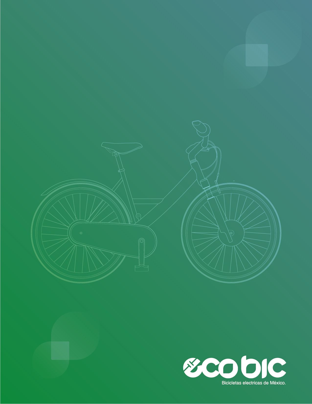
Logo Design
It is intended to use geometric and organic shapes trying to leave aside corners as far as possible, since these are not related to elements of nature, green tones are chosen as in the previous proposal for their psychological proper- ties related to ecology, and dark to generate high contrast in the design, the letter 'E' has been rotated 45 degrees to give it a sensation of movement.